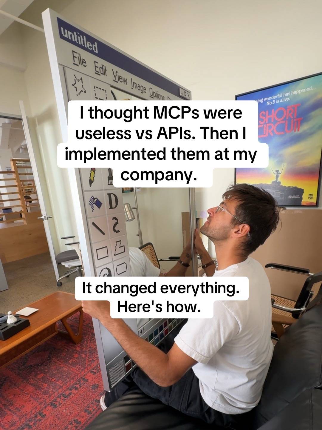
Loading video…
All breakouts
 11 videos
12.3App DemoDirect Question hookAI Tools
Hook
How does bro have unlimited RAM?
@dreamteampov
7.2K followers · usually 6.9K views a post
Views
78.9K
Likes
1.6K
Comments
73
Shares
102
Promoted product
Tidbittidbit.ai
The collaborative AI chat app
Why it worked
The video uses a relatable tech-humor hook ('unlimited RAM') to draw in viewers, then seamlessly transitions into a high-quality product demonstration that feels like a genuine design critique.
Summary
A user demonstrates an AI tool called Tidbit that is managing a complex, text-heavy interface with many tabs open. The video highlights the tool's ability to maintain a cohesive design system and human-like personality in its AI-generated responses.
Structure
- 1Visual of many browser tabs open
- 2Close-up of the AI interface
- 3Scrolling through AI-generated text
- 4Highlighting design and font choices
Original caption
The amount of tabs open is unbelievable #Tech #ai #browser #software
More from @dreamteampov
More breakout videos from this creator.