Loading video…
All breakouts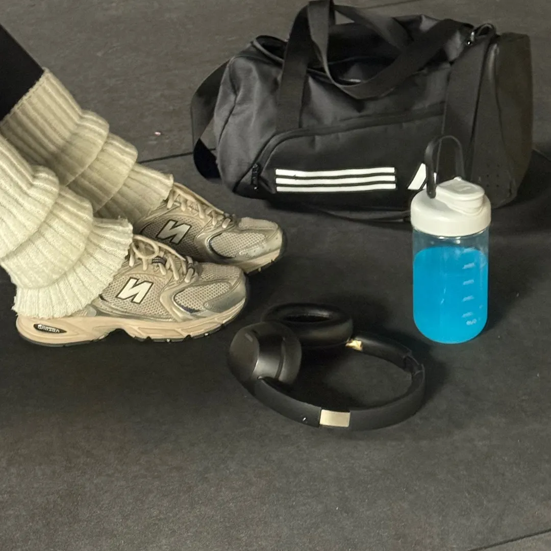
26.3Text-HeavyHealth
Hook
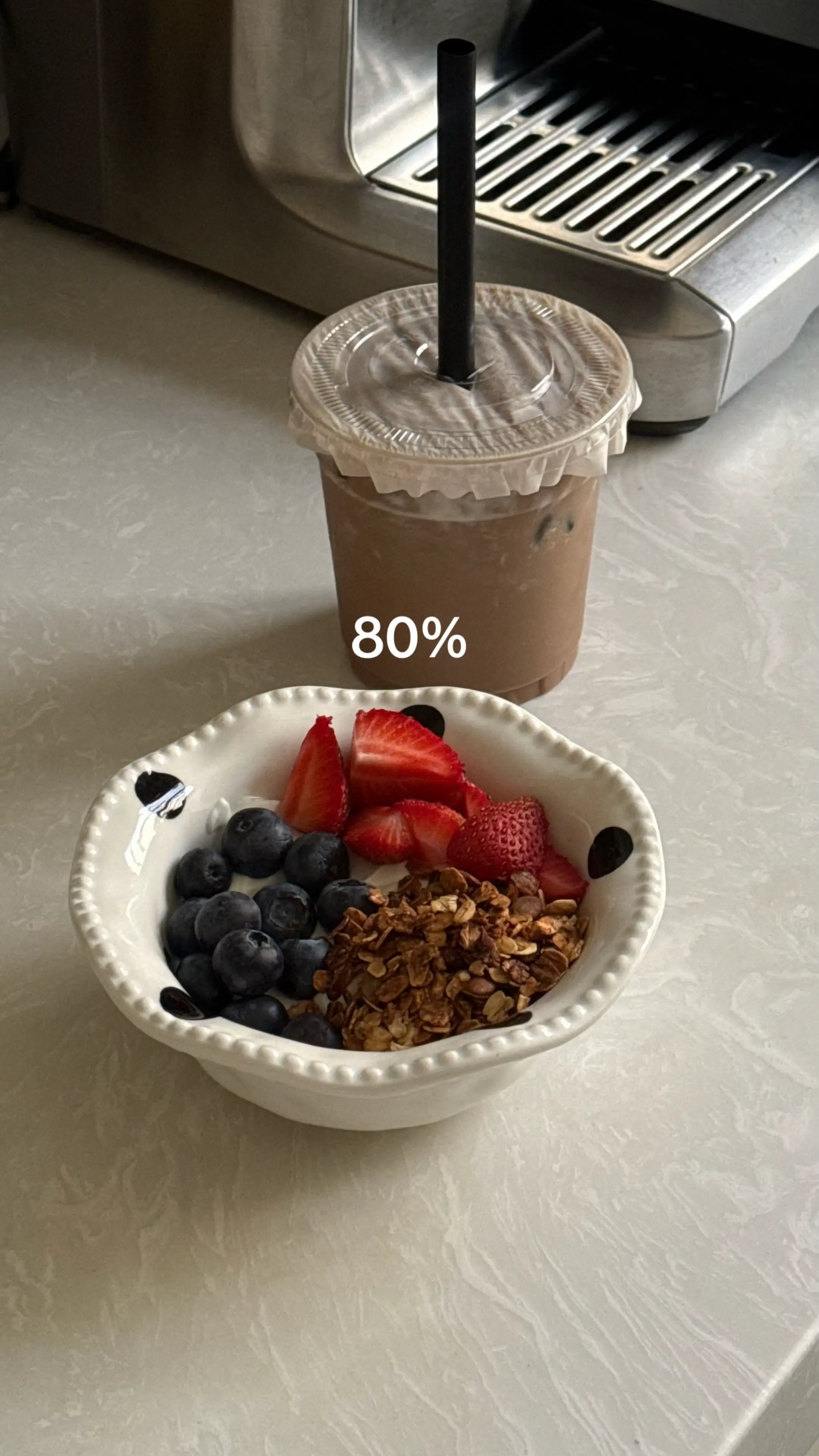
80%
@axm.59
4.4K followers · usually 2.6K views a post
Views
57.8K
Likes
5.6K
Comments
48
Shares
275
Why it worked
The visual appeal of diverse food items, presented in a clear and organized slideshow format with percentage indicators, likely resonated with viewers interested in food, lifestyle, or meal tracking content.
Summary
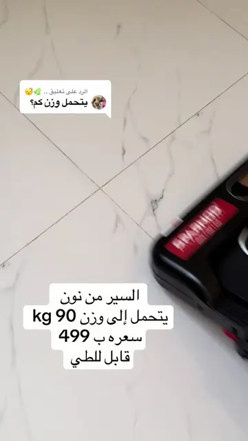
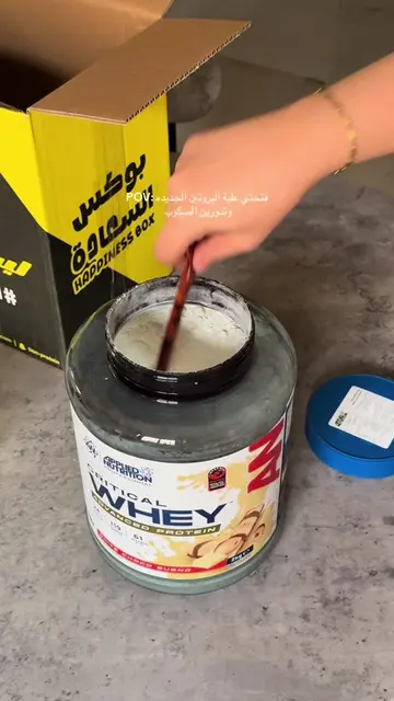
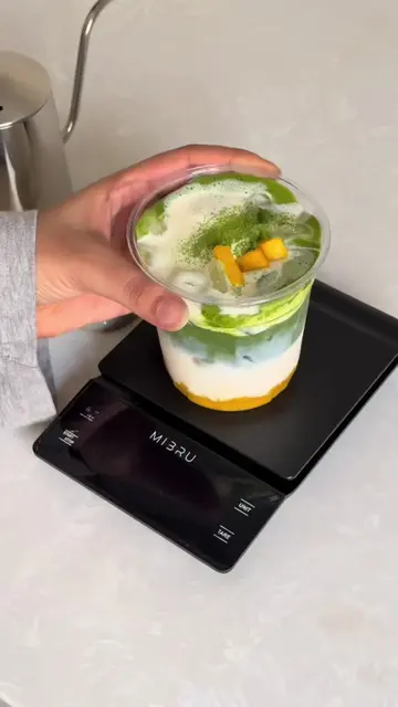
The post displays a series of images showcasing meals and food items, with percentages overlaid on each slide. The initial slides show various meals and drinks with "80%" displayed, followed by slides with "20%" displaying desserts and other dishes. The content appears to be a visual representation of food consumption or meal planning.
Structure
- 1Introduction of meals with 80% indicator
- 2Transition to desserts and other dishes with 20% indicator
- 3Visual showcase of food items
On-screen text
80%
80%
80%
80%
80%
80%
80%
80%
20%
20%
20%
20%
20%
20%
Original caption
#حياه_صحية #دايت #نظام_صحي #explore #4u
More from @axm.59
More breakout videos from this creator.