Loading video…
All breakouts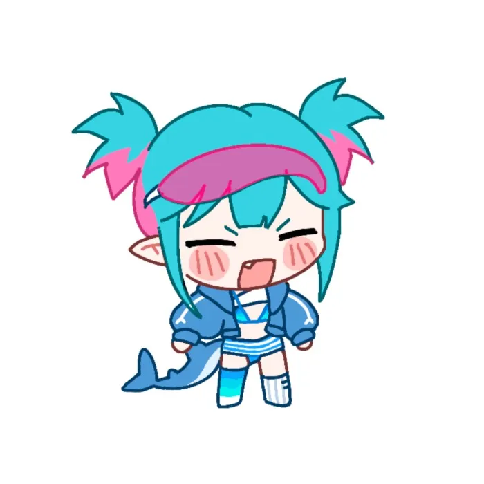
6.1App DemoHow-To hookCreator Economy
Hook
Quick Shading Tutorial
@peeweearty
9.8K followers · usually 5.5K views a post
Views
31.4K
Likes
5.2K
Comments
27
Shares
204
Why it worked
The video provides a concise and visually appealing tutorial on a specific art technique, making it easily digestible and shareable for artists looking to improve their skills quickly.
Summary
This video demonstrates a quick shading tutorial for digital artwork, focusing on a simple method to achieve good results efficiently. It guides viewers through selecting colors, applying shadows, and refining the shading for a smoother transition and a more polished look.
Structure
- 1Introduction to quick shading tutorial
- 2Selecting and applying shadow colors
- 3Erasing light areas and using references
- 4Using softer brushes for smoother transitions
- 5Adjusting dark areas with lighter colors
- 6Finalizing the artwork with shading effects
On-screen text
Quick Shading Tutorial
My Simple Shading Method for Quick Artwork
Pick a darker color that fits your artwork
-> Brown, Purple, Blue
Erase the areas where the light will fall later.
If there's no background, just imagine a light source.
If you're having trouble with this, pick a reference and see how the light falls there.
Use a softer brush to give some areas a smoother look
Create a clipping mask
and color the edges of the shadow layer
-> This creates a smoother transition
from shadow to light
If some areas are too dark, go over them
again with a slightly lighter color.
That will make your artwork pop.
That's it!
After adding shading, I'll add a few more effects
like lighting, blur, and color correction. I'd be happy
to show you how I do that in another video.
I'm no expert, but I hope this helped you
Original caption
Quick Shading Tutorial This is the shading method I use when I want to shade quickly but still get good results. For example, for an Artfight attack. 🫶 #digitalart #artfight #artfight2026 #arttiktok #artist
More from @peeweearty
More breakout videos from this creator.