Loading video…
All breakouts
7.4Talking HeadDirect Question hookLifestyle
Hook
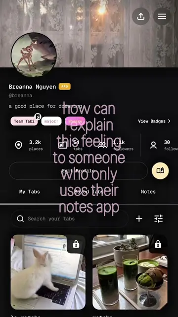
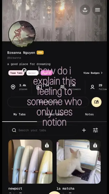
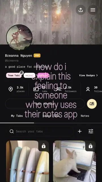
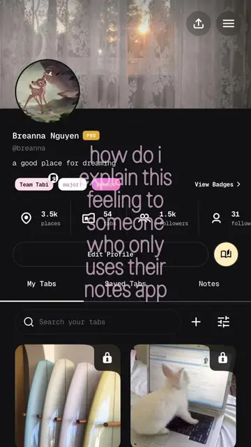
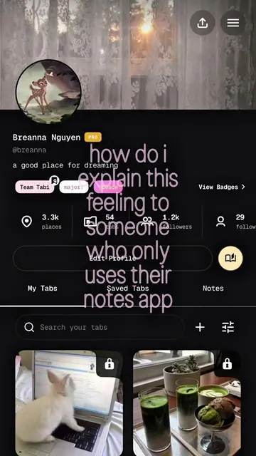
how do i explain this feeling to someone who only uses their notes app
@byybrie
4.1K followers · usually 5.2K views a post
Views
38.1K
Likes
4.5K
Comments
25
Shares
177
Why it worked
The video uses a relatable question about explaining a feeling to someone who uses a basic notes app, combined with visually appealing content from a digital organization app, to pique viewer curiosity about alternative organization methods.
Summary
The video shows various screens of a digital organization app, displaying different tabs and saved items. The on-screen text asks how to explain a certain feeling to someone who only uses their notes app, implying the app offers a superior or different way of organizing thoughts and experiences.
Structure
- 1Opening screen of the app with tabs like 'My Tabs', 'Saved Tabs', 'Notes'.
- 2Search bar and a plus icon for adding new content.
- 3Display of various saved tabs with images and titles (e.g., 'newport', 'matcha', 'salt bread').
- 4Scrolling through different sections and locations within the app.
- 5A screen showing a map with pins and a list of places with dates.
- 6The final screen shows a cropped image with a grid overlay, suggesting editing or presentation features.
On-screen text
how do i
explain this
feeling to
someone
who only uses
their notes app
Original caption
i absolutely adore this and i hope you do too ⋆.˚🪻༘⋆ #pinterestgirl #digitaljournal #organize #digitaldiary #whimsy
More from @byybrie
More breakout videos from this creator.