Loading video…
All breakouts
3.4Talking HeadDirect Question hookSaaS
Hook
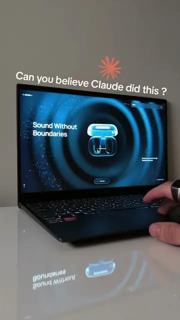
Can you believe Claude F5 did this ?
@webloved
98.1K followers · usually 15.8K views a post
Views
45.5K
Likes
2.5K
Comments
17
Shares
183
Why it worked
The video effectively demonstrates the power of an AI tool (Claude F5) by showcasing visually impressive results, creating curiosity and driving viewers to seek more information about the creator's academy.
Summary
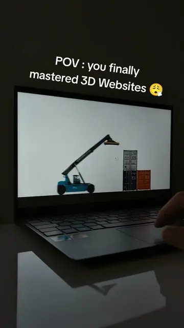
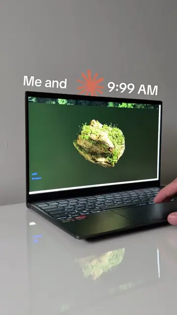
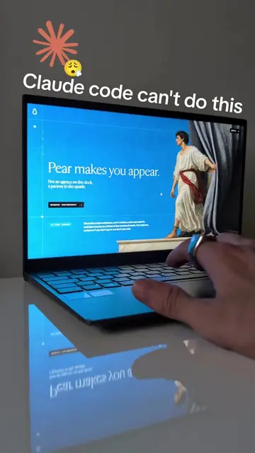
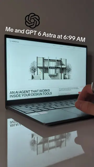
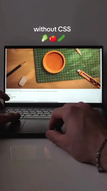
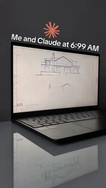
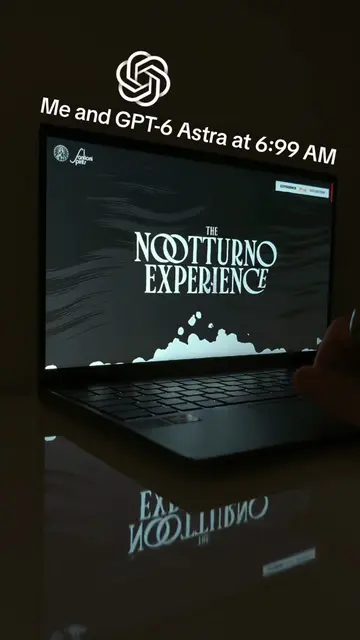
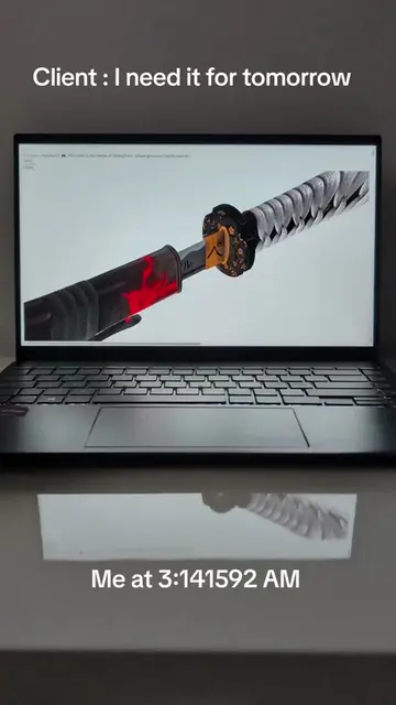
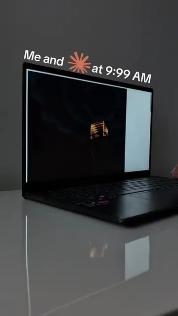
The video showcases the capabilities of Claude F5 by displaying various generated images on a laptop screen. The creator highlights that the Academy, which teaches these skills, is available in their bio.
Structure
- 1Introduction of Claude F5's capabilities
- 2Displaying generated images on a laptop
- 3Highlighting the Academy in bio
Product placement
Claude F5 ACTS - it generates images shown on the laptop screen. Removing it would change what happens in the video.
Call to action
Original caption
How I build with Claude 👇 Academy in bio 🔗 Three formulas make type over drone footage feel monumental instead of pasted on: Set letter-spacing in em, never in px. One em equals the current font-size, so 0.2em stays proportional whether the headline is 20 pixels on a phone or 200 on a desktop, that single unit choice is why wide serif tracking looks carved on every screen instead of falling apart on mobile. Grade the footage in CSS instead of re-exporting, stack filters on the video, saturate around 1.1, contrast around 1.05 and a touch of sepia, and any clip snaps into one warm cohesive palette, tweak it live in devtools until it matches your brand. Add a vignette with a radial-gradient overlay, transparent in the middle fading to dark at the edges, it darkens the corners so the eye falls to the center and your text stays readable no matter what frame is playing. Save this if you want cinematic type over video 🏛️ #claudefable5 #buildinpublic #webdesign #typography #fyp
More from @webloved
More breakout videos from this creator.