Loading video…
All breakouts
2.5OtherOther hookCreator Economy
Hook
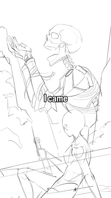
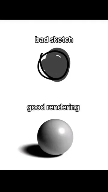
bad sketch
@umardoesarts
16.3K followers · usually 7.1K views a post
Views
17.5K
Likes
2.8K
Comments
33
Shares
54
Why it worked
The video likely worked due to its relatable "sketch vs. final" concept, visually demonstrating the value of polish in art. The striking artistic imagery and use of trending audio would also contribute to its reach.
Summary
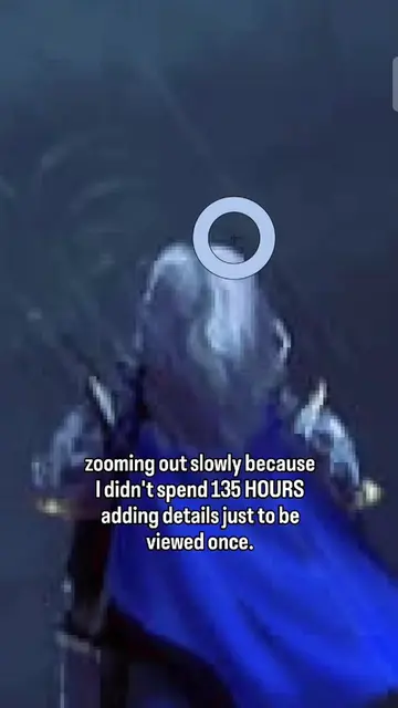
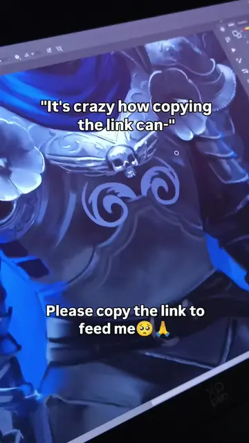
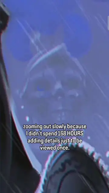
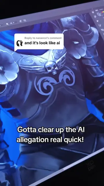
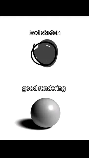
The video contrasts a "bad sketch" with a "good rendering" of a sphere, demonstrating the difference between a rough idea and a polished final product. It then transitions to an artistic depiction of armored figures, implying a similar transformation from concept to detailed artwork.
Structure
- 1Bad sketch vs. good rendering comparison
- 2Transition to artistic imagery
- 3Showcase of armored figures
- 4Implied transformation/polish
Call to action
Who else relies on the polish phase? 👇
On-screen text
bad sketch
good rendering
Original caption
The sketch was a cry for help, but rendering saved the day. 🫣✨Who else relies on the polish phase? 👇 #arttok #oc #sketchvsfinal #digitalart #arttrend
More from @umardoesarts
More breakout videos from this creator.