Loading video…
All breakouts
13.2OtherListicle hookConsumer Apps
Hook
10 years of iOS icon design evolution.
@howtobuyiphone15
33.6K followers · usually 17.3K views a post
Views
223.9K
Likes
1.8K
Comments
10
Shares
37
Why it worked
The video leverages strong nostalgia and a clear, visually satisfying 'then vs. now' comparison format that is highly shareable and easy to consume.
Summary
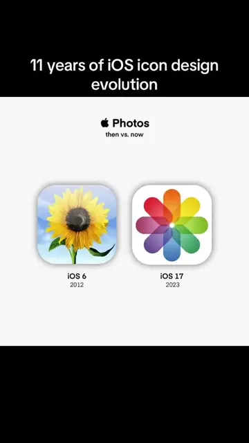
This video displays a side-by-side comparison of various Apple app icons from iOS 6 in 2012 versus their current appearance in iOS 17. It highlights the design evolution of icons like Wallet, Maps, Contacts, FaceTime, Clock, and Weather.
Structure
- 1Title card showing the topic
- 2Comparison of Wallet icon
- 3Comparison of Maps icon
- 4Comparison of Contacts icon
- 5Comparison of FaceTime icon
- 6Comparison of Clock and Weather icons
On-screen text
10 years of iOS icon design evolution.
Apple Wallet
then vs. now
iOS 6
2012
iOS 17
2023
Apple Maps
then vs. now
iOS 6
2012
iOS 17
2023
Apple Contacts
then vs. now
iOS 6
2012
iOS 17
2023
Apple FaceTime
then vs. now
iOS 6
2012
iOS 17
2023
Apple Clock
then vs. now
iOS 6
2012
iOS 17
2023
Apple Weather
then vs. now
iOS 6
2012
iOS 17
2023
Original caption
10 years of iOS icon design evolution. #iphonewallet #iphonemaps #iphonecontact #iphonefacetime #facetime #iphoneclock #iphoneweather #ioswallpaper #weatherapp #clockapp #mapsapp #contactapp #ios #icondesign #design #appicons #appicons #iosicons #evotution #ios17 #ios17beta #ios16 #ios16beta #ios15 #ios14 #ios13 #ios12 #ios11 #ios10 #ios9 #ios8 #ios7 #ios6
More from @howtobuyiphone15
More breakout videos from this creator.