Loading video…
Sound

original sound - setups_ai
SetupsAI · Original audio
0:00–:––
Playing this video’s own audio, so you’ll hear the creator over the sound.
The video effectively leverages a common creator pain point (finding useful web development tools) and provides a direct solution with a visually appealing and diverse set of resources. The rapid-fire showcase of numerous components, each with clear customization options, appeals to developers looking for quick, impactful design elements.
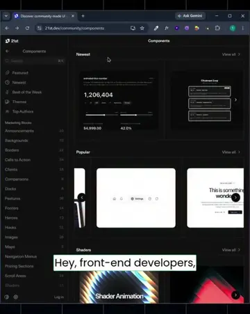
This video showcases React Bits, a website offering a vast collection of customizable animated UI components and backgrounds for developers. It demonstrates various components like Strands, Lightfall, Radar, Galaxy, Magic Bento, Flowing Menu, Border Glow, and Magnet Lines, highlighting their customization options and ease of integration.
Powerful websites you should know (part 760) find almost any animated components #components #development #animation
POWERFUL WEBSITES YOU SHOULD KNOW (PART 760)
Introduction of "Powerful Websites You Should Know"
Showcase of React Bits website and its purpose
Demonstration of various animated components (Strands, Lightfall, Radar, Galaxy)
Showcase of utility components (Magic Bento, Flowing Menu, Border Glow)
Demonstration of code integration and other components (Magnet Lines, Shape Blur)
React Bits (ACTS - provides animated UI components and backgrounds for developers; removing it would change what happens in the video)
Playing this video’s own audio, so you’ll hear the creator over the sound.
Promotes 15 products. Create free account to see more.
Outliers and viral hits: their videos on Overshot, all time.
Open-source animated React components for developers building interactive user interfaces
All time.