Loading video…
All breakouts
6.2AnimationOther hookEducation
Hook
Life Expectancy At Birth (Years)
@economy.wars2
2.9K followers · usually 5.7K views a post
Views
34.9K
Likes
447
Comments
36
Shares
6
Why it worked
The video uses a clear and visually engaging animated graph to present data on life expectancy, which is a topic of general interest. The comparison between two major global powers, the US and China, adds to its appeal. The use of a trending audio and a clear call to action encourages engagement.
Summary
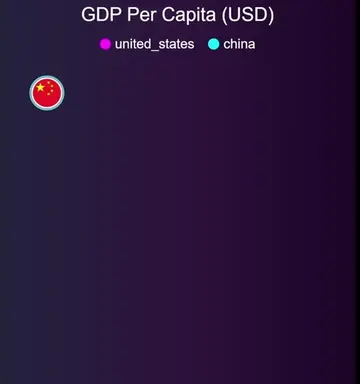
This video displays a graph showing the life expectancy at birth in China and the United States from 1960 to 2024. The graph illustrates how life expectancy has increased in both countries over time, with the United States consistently having a higher life expectancy than China.
Structure
- 1Introduction of the graph comparing life expectancy
- 2Display of data from 1960s to 2020s
- 3Visual representation of increasing life expectancy in both countries
- 4Highlighting the gap between US and China's life expectancy
Call to action
Drop your thoughts below!
On-screen text
Life Expectancy At Birth (Years)
China
United States
1961
1962
1964
1966
1967
1969
1971
1972
1974
1976
1977
1979
1981
1982
1984
1986
1987
1989
1991
1992
1994
1996
1997
1999
2001
2002
2004
2006
2007
2009
2011
2012
2014
2016
2017
2019
2021
2022
2024
Original caption
Which country lives longer? 🤔💀 US vs China: Who wins in life expectancy? Let's find out! 💥 Drop your thoughts below! 🗣️👇 #LifeExpectancy #China #USA #Health #Longevity #GlobalHealth #TikTokTrends #Viral #DidYouKnow #InterestingFacts #Comparison #Data #HealthFacts #ChinaHealth #USAHealth #PublicHealth #Wellbeing #Future #WorldNews #Economy #Healthcare #HealthCareSystem #Demographics #Aging #GlobalComparison #Science #Research #LearnOnTikTok #TikTokEducation #USvsChina #LifeExpectancy #GlobalStats #HealthComparison #Longevity #HealthJourney #LifeExpectancyExplained #StatsThatMatter #ViralVideo #TrendingNow #TikTokTrend #TikTokFacts #ViralChallenge #ViralTikTok #KnowYourStats #HealthHacks #ChinaVsUSA #SurprisingFacts #FactOfTheDay #HealthMatters #LivingLonger #LifeExpectancyRace#us
More from @economy.wars2
More breakout videos from this creator.