Loading video…
All breakouts
66.3Talking HeadOther hookAI Tools
Hook
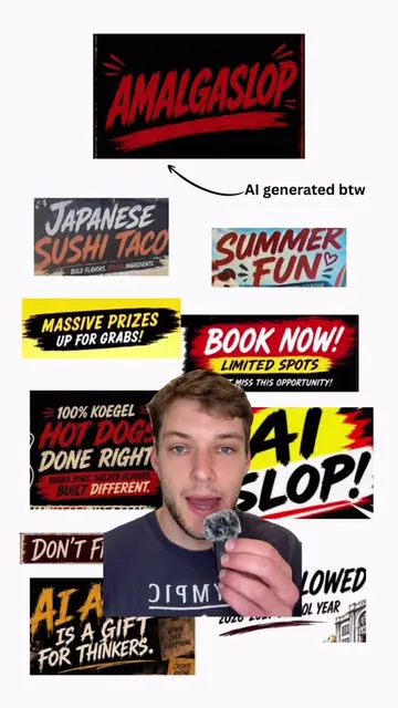
All vibe coded websites look like this
@yatesvids
12.0K followers · usually 7.3K views a post
Views
111.3K
Likes
5.1K
Comments
102
Shares
340
Promoted product
ImplementAIFast.comhttps://implementaifast.com/free-prompts ↗
Why it worked
The video identifies a common pain point (generic AI design) and offers an immediate, actionable solution, positioning the creator as an expert while driving traffic to his own resources.
Summary
The creator explains why AI-generated websites often look generic and provides a specific prompt to help users create more unique, high-quality designs. He encourages viewers to use his provided design brief to improve their website's aesthetic and conversion potential.
Structure
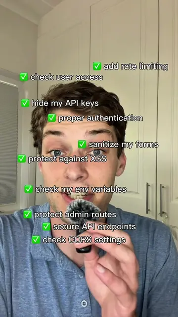
- 1Identify the problem of generic AI-generated websites
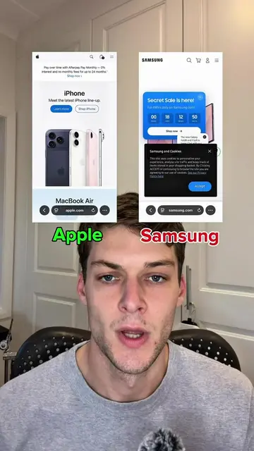
- 2Explain why AI produces repetitive designs
- 3Provide a superior alternative design brief
- 4Encourage viewers to use the provided prompt
Product placement
The creator promotes his own AI prompt resource, linked in his bio, as a solution to the problem discussed.
Call to action
Use the provided prompt in the caption to build a better website.
On-screen text
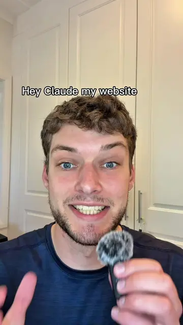
All vibe coded websites look like this
Start it. Build it. Launch it.
Track Your Time, Boost Productivity
Build me a perfect website. Make no mistakes
Before building this website, do not default to generic SaaS, startup, AI-tool, or “modern landing page” aesthetics.
Act as a senior web designer, brand strategist, copywriter, and front-end developer.
Website details:
Business name: [insert]
Offer: [insert]
Target audience: [insert]
Primary goal: [book a call / buy / sign up / request quote]
Brand personality: [premium / bold / playful / technical / luxury / minimalist / gritty / calm]
Main CTA: [insert]
Design references I like: [insert]
Designs I dislike: [insert]
Avoid:
- Purple-blue gradients
- Glassmorphism cards
- Floating dashboards
- Random glowing blobs
- Generic feature grids
- Startup-style hero sections
- Vague corporate copy
- Buzzwords like "unlock," "supercharge," "streamline," and "seamless"
Create:
- A distinct visual concept
- Strong typography
- Specific human copy
- Purposeful spacing
- A memorable hero section
- Layout choices that fit the audience
- A clear conversion path
Before building, give me 3 creative directions. Then choose the strongest one and build from that.
Make it responsive, fast, clean, conversion-focused, and visually custom.
Original caption
There is a vibe coded website slop epidemic. PASTE THIS PROMPT BEFORE YOU BUILD YOUR WEBSITE👇 Before building this website, do not default to generic SaaS, startup, AI-tool, or “modern landing page” aesthetics. Act as a senior web designer, brand strategist, copywriter, and front-end developer. Website details: Business name: [insert] Offer: [insert] Target audience: [insert] Primary goal: [book a call / buy / sign up / request quote] Brand personality: [premium / bold / playful / technical / luxury / minimalist / gritty / calm] Main CTA: [insert] Design references I like: [insert] Designs I dislike: [insert] Avoid: - Purple-blue gradients - Glassmorphism cards - Floating dashboards - Random glowing blobs - Generic feature grids - Startup-style hero sections - Vague corporate copy - Buzzwords like “unlock,” “supercharge,” “streamline,” and “seamless” Create: - A distinct visual concept - Strong typography - Specific human copy - Purposeful spacing - A memorable hero section - Layout choices that fit the audience - A clear conversion path Before building, give me 3 creative directions. Then choose the strongest one and build from that. Make it responsive, fast, clean, conversion-focused, and visually custom. #claudeai #Claude #ai #vibecoding
More from @yatesvids
More breakout videos from this creator.