Loading video…
All breakouts
41.0Talking HeadCuriosity Gap hookAI Tools
Hook
you've probably noticed
@yatesvids
12.0K followers · usually 7.3K views a post
Views
263.3K
Likes
19.8K
Comments
324
Shares
712
Why it worked
The creator uses a relatable and humorous observation about a common design flaw in AI-generated content, coining a memorable term for it. This taps into a shared frustration and provides a simple, actionable tip.
Summary
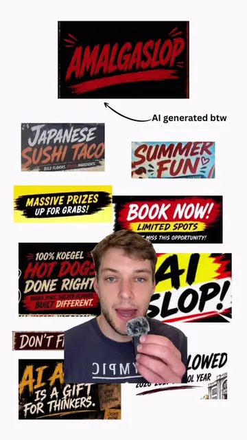
The creator discusses a common, poorly designed font often used by AI-generated content, which they've dubbed "amalgaslop." They suggest that if users continue to use AI for design, they should at least provide it with real fonts to avoid this generic look.
Structure
- 1Introduction to the common AI font
- 2Naming the font "amalgaslop"
- 3Explaining the origin of the font
- 4Suggesting a solution for better AI-generated designs
On-screen text
MASSIVE PRIZES
UP FOR GRABS!
100% KOEGEL
HOT DOGS
DONE RIGHT!
BOOK NOW!
LIMITED SPOTS
DON'T MISS THIS OPPORTUNITY
amalgamation + slop
= AMALGASLOP
Transcript
you've probably noticed that AI loves using this specific font. you see it when you see those AI slop posters or ads. Now this font doesn't exactly have its own name, rather it's an amalgamation from the tens of thousands of images of training data that the model had. For that reason, I propose this font be called amalgaslop. Now if you can't be convinced to stop using AI to create posters and ads, at least just Google a real font and give the AI that. The output will still look AI generated, but at least it won't be this amalgaslop font that we all
Original caption
I call this font “amalgaslop”
More from @yatesvids
More breakout videos from this creator.