Loading video…
All breakouts
2.7Talking HeadDirect Question hookConsumer Apps
Hook
HAS APPLE ALREADY WON?
@tomsguide
430.0K followers · usually 18.9K views a post
Views
85.0K
Likes
1.8K
Comments
280
Shares
97
Why it worked
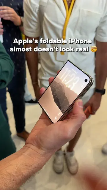
The video taps into the ongoing debate about foldable phone technology and app optimization, a key pain point for users. By comparing existing solutions with a highly anticipated rumored product (iPhone Ultra), it generates intrigue and positions Apple as a potential disruptor.
Summary
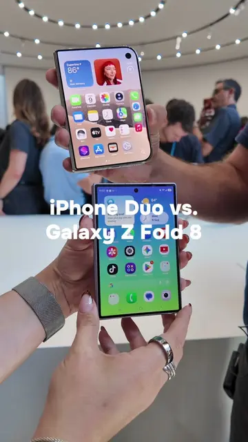
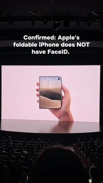
The video compares the app optimization on Samsung's foldable phones with the potential of Apple's rumored foldable iPhone. It highlights how Samsung's devices struggle with third-party app scaling, while Apple's iOS is expected to handle this better, potentially giving them an advantage.
Structure
- 1Introduction of the foldable phone dilemma
- 2Discussion of iOS and potential iPhone Ultra app scaling
- 3Comparison of app optimization on Samsung foldables (TikTok, Instagram, Slack)
- 4Highlighting the advantage of iPadOS and the potential of Apple's approach
- 5Conclusion on why Apple might win from day one
Product placement
Apple: ACTS - its operating system (iOS) is discussed in terms of its ability to handle multitasking and app scaling on foldable devices. Removing it would change the video's topic. Samsung: ACTS - its foldable devices (Galaxy Z Fold) are discussed in terms of their hardware and software optimization for apps. Removing it would change the video's topic. iPhone Ultra: ACTS - it is a rumored foldable iPhone discussed in terms of its potential app scaling capabilities. Removing it would change the video's topic. Galaxy Z Fold: ACTS - it is a foldable device discussed in terms of its app optimization. Removing it would change the video's topic. iOS: ACTS - it is the operating system discussed for its multitasking and app scaling features on foldable devices. Removing it would change the video's topic. iPadOS: ACTS - it is an operating system mentioned as having features that work well on foldable devices. Removing it would change the video's topic. Samsung's Flex Mode: ACTS - it is a feature of Samsung devices that allows splitting the screen. Removing it would change the video's topic. TikTok: ACTS - it is an app shown to have good optimization on foldable devices, with comments visible on the side. Removing it would change the video's topic. Instagram: ACTS - it is an app shown on a foldable device, with comments visible on the side. Removing it would change the video's topic. Asus Chromebook Cx15: APPEARS - it is shown on a screen within the video, but its functionality is not demonstrated or discussed. Removing it would not change what happens in the video. Slack: ACTS - it is an app shown on a foldable device, with its layout and lack of optimization discussed. Removing it would change the video's topic. Google: ACTS - its apps are mentioned as being well-optimized for foldable devices. Removing it would change the video's topic. Android: ACTS - it is an operating system mentioned in the context of app optimization on foldable devices. Removing it would change the video's topic.
Original caption
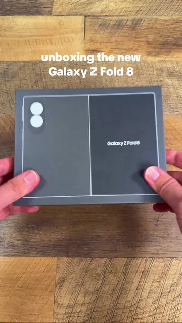
Foldable hardware has come a long way, but third-party developers are still sleeping on big-screen optimization for Samsung's Galaxy Z Fold. While Google nailed its own apps, too many popular third-party apps feel like... missed opportunities? So if Apple drops its rumored 'iPhone Ultra' with instant iPadOS app scaling, Samsung’s lead in the foldable market might be in big trouble. We want to hear from current foldable users: Which app layout annoys you the most on a big screen? #GalaxyFold #iPadMini #TechComparison #iPhoneUltra #iPhoneFold
More from @tomsguide
More breakout videos from this creator.