Loading video…
All breakouts
3.9Text-HeavyStory Open hookFinance
Hook
SPACEX
@marketdraft
32.9K followers · usually 714 views a post
Views
2.9K
Likes
17
Comments
3
Shares
3
Why it worked
The post leverages a timely and relevant financial topic (stock performance of a high-profile company) with clear, concise data visualization and a direct statement about the stock's decline, appealing to investors and those interested in market trends.
Summary
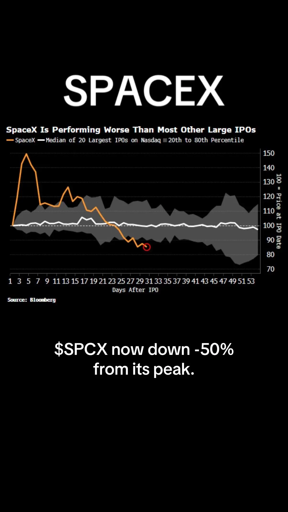
This post analyzes the stock performance of SpaceX, showing a graph that illustrates its performance relative to other large IPOs. The text indicates that $SPCX is down 50% from its peak.
Structure
- 1Title slide: SPACEX
- 2Graph title and legend
- 3Stock performance graph
- 4Source and current stock status
Product placement
Bloomberg ACTS as a data source, providing the information displayed in the graph. Removing it would mean the source of the data is unknown, which would change the credibility of the information presented. SpaceX ACTS as the subject of the analysis, its stock performance is being discussed. Removing it would mean the video is about nothing. $SPCX ACTS as the ticker symbol for SpaceX, representing the stock being discussed. Removing it would mean the specific stock being discussed is unknown.
On-screen text
SPACEX
SpaceX Is Performing Worse Than Most Other Large IPOs
- SpaceX - Median of 20 Largest IPOs on Nasdaq 20th to 80th Percentile
1 3 5 7 9 11 13 15 17 19 21 23 25 27 29 31 33 35 37 39 41 43 45 47 49 51 53
Days After IPO
Source: Bloomberg
$SPCX now down -50%
from its peak.
Original caption
25% below IPO value. 50% down from peak. SpaceX looking like a bargain yet or more bleeding to go? #stockmarket
More from @marketdraft
More breakout videos from this creator.