Loading video…
All breakouts
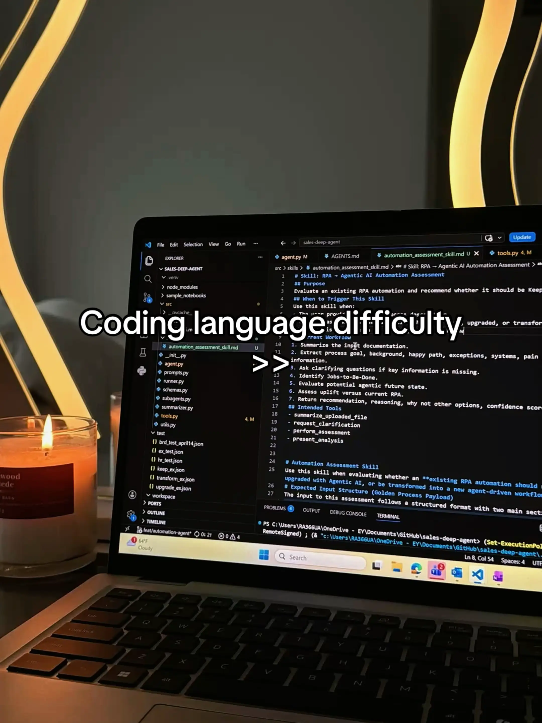
4.2Text-HeavyDirect Question hookEducation
Hook
Coding language difficulty
@sideme.ai
68.3K followers · usually 28.5K views a post
Views
115.3K
Likes
9.1K
Comments
212
Shares
392
View velocity
+60.1K views over 26.0d · ~2.3K/day · 6 observations
Why it worked
The post likely performed well due to its direct and informative nature, addressing a common pain point for aspiring programmers: understanding the relative difficulty of different languages. The visual presentation with clear percentages and bar graphs makes the information easily digestible and shareable.
Summary
The first slide displays text about coding language difficulty, followed by a second slide that presents a "Language Difficulty Guide" with a bar chart showing the difficulty percentages for various programming languages like HTML & CSS, JavaScript, Java, Python, C#, C++, and Kotlin.
Structure
- 1Introduction to coding language difficulty
- 2Presentation of a language difficulty guide
- 3Detailed breakdown of difficulty percentages for multiple languages
On-screen text
Coding language difficulty
LANGUAGE
DIFICULTY GUIDE
HTML & CSS
25%
JavaScript
52%
Java
73%
Python
45%
C#
52%
C++
85%
Kotlin
61%
Original caption
#computerscience #coding #programming #learntocode #learncoding
More from @sideme.ai
More breakout videos from this creator.