Loading video…
All breakouts
13.2Text-HeavyOther hookAI Tools
Hook
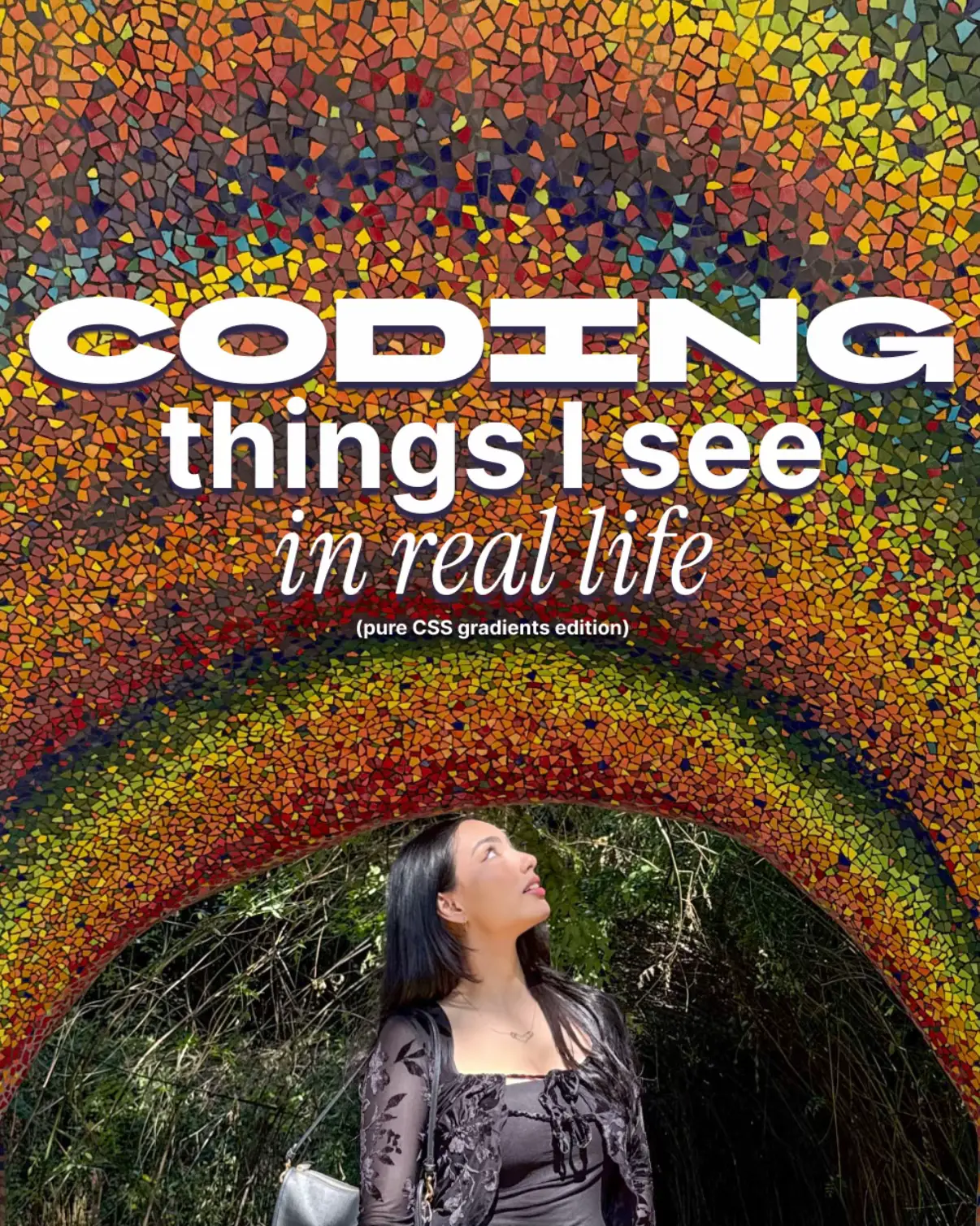
CODING things I see in real life
@pikacodes
196.7K followers · usually 8.1K views a post
Views
111.1K
Likes
18.0K
Comments
106
Shares
839
Why it worked
The post leverages the visual appeal of everyday life and translates it into practical, shareable CSS code snippets. This format appeals to both designers and developers by bridging the gap between inspiration and implementation, making it highly relatable and educational.
Summary
This post showcases real-life visual inspirations and their corresponding CSS code implementations. It presents examples of gradients, checkerboards, and layered designs, demonstrating how everyday aesthetics can be translated into web development.
Structure
- 1Introduction to "Coding things I see in real life"
- 2Example 1: Sunset gradient and its CSS code
- 3Example 2: Checkerboard pattern and its CSS code
- 4Example 3: Pink gradient circle and its CSS code
- 5Example 4: Layered landscape design and its CSS code
- 6Example 5: Sky gradient and its CSS code
On-screen text
CODING
things I see
in real life
(pure CSS gradients edition)
[ life ]
#A3A1A6
#DBCAAE
#FDD597
#F3AC94
.gradient {
background: #A3A1A6;
background: linear-gradient(
160deg, #A3A1A6 45%, #DBCAAE 81%, #FDD597 89%);
}
css-doodle {
box-shadow:
@m10 (@r(100vw) @r(100vh) @r(30vmin,50vmin) @r(40vmin))
@pd(#f3ac94, #f3ac94));
}
[ code ]
[ life ]
#0A090E
#D7D8DA
.checkerboard {
height: 400px;
width: 700px;
background:
repeating-conic-gradient(
#D7D8DA 0% 25%,
#0A090E 0% 50%) left top / 160px 150px;
}
[ code ]
[ life ]
#FB46B9
#CE1241
#FEFEFE
.gradient {
border-radius: 50%;
height: 51vmin;
width: 50vmin;
background: #FEFEFE;
ellipse at 50% 55%,
#FEFEFE 17%,
#FB46B9 46%,
#CE1241 88%);
};
[ code ]
[ life ]
#323234
#758372
#A49B72
#3B424C
#90997C
#C3AF81
#4A515B
#A2AC8A
#D8BA83
#4D565D
#AEAF89
#D5AB78
#687377
#9D9F7A
#E1B37D
#5C6866
#A49C76
#6B7B7A
#BBB289
.layers {
background: #3b3a3a;
background:
linear-gradient(
270deg,
#323234 54%,
#494748 55%);
clip-path: polygon(
0% 46%,
4% 48%,
9% 46%,
14% 48%,
[...]);
}
[ code ]
[ code ]
#29456A
#7888A7
#C1B08A
#FEE281
.gradient {
background: #29456A;
background: linear-gradient(
180deg,
#29456A 0%,
#7888A7 69%,
#C1B08A 89%,
#FEE281 100%
);
}
[ life ]
Original caption
coding things i’ve seen lately bc why not. 🤍 i love CSS!!! #programming #coding #uiux #design
More from @pikacodes
More breakout videos from this creator.