Loading video…
All breakouts
37.1Text-HeavyContrarian hookAI Tools
Hook
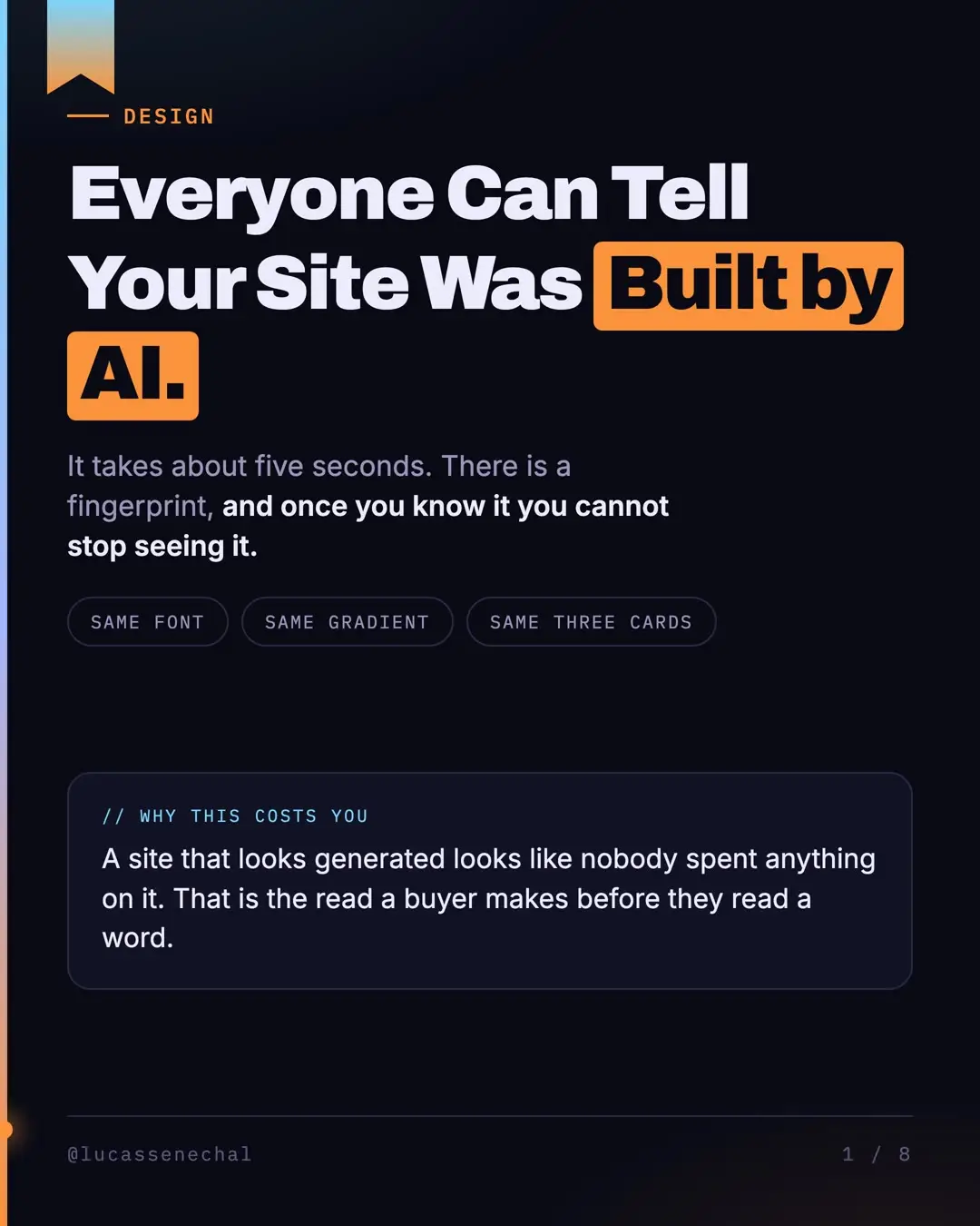
DESIGN Everyone Can Tell Your Site Was Built by AI.
@lucassenechal
11.1K followers · usually 151 views a post
Views
5.5K
Likes
71
Comments
0
Shares
6
Promoted product
The Busy Owner's AI Guide: Zero to First Agent in 15 Minuteslucassenechal.com/go/tt ↗
Why it worked
The post addresses a common pain point for creators using AI for website design, offering practical, actionable advice in a clear, visually appealing format. The "fingerprint" concept is relatable and the breakdown of specific design elements makes the advice easy to understand and implement.
Summary
This TikTok post explains how AI-generated websites have a distinct "fingerprint" that is easily recognizable. It details four common tells of AI-generated design and offers solutions for creators to avoid them by making deliberate design choices before using AI tools.
Structure
- 1Introduction to AI website fingerprint
- 2Four common tells of AI design
- 3Explanation of why AI defaults to average
- 4How to fix AI design by making deliberate choices
- 5What goes into good design files
- 6Borrowing decisions from existing sites
Original caption
Inter, an indigo-to-purple gradient, three rounded cards in a row, and a hero section that would work for any company on earth. That's the fingerprint. Once you've seen it you can't unsee it, and your buyers clock it too. They just don't have a name for it. The part I find genuinely funny is that it isn't bad taste. A model answers with the middle of everything it has seen, and the middle of web design since 2019 is one specific purple, because that's the default in the most popular styling framework on the web. The person who chose that default has publicly apologised for it. So asking it to make things look better just gets you a different average. You have to decide before it builds. Two fonts, three colours, one spacing rule, and a list of things it must never do. Not a designer? Find three sites you like, write down what they have in common, hand that over. That's the whole file. It won't make you a designer. It will stop your site announcing how it was made. #AI #WebDesign #ClaudeAI #SmallBusiness #Branding #AITools
More from @lucassenechal
More breakout videos from this creator.