Loading video…
All breakouts
10.3Text-HeavyStory Open hookLifestyle
Hook
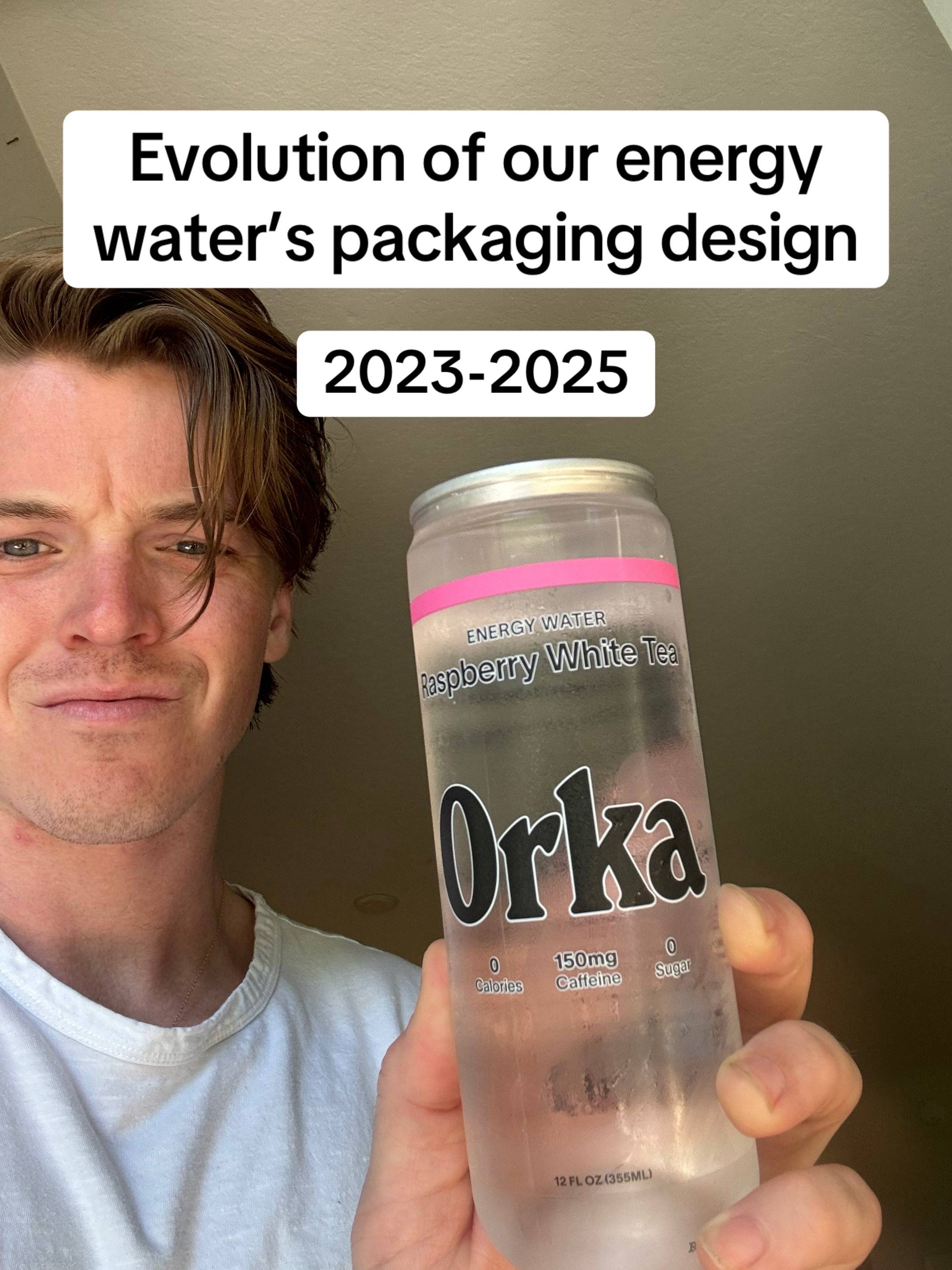
Evolution of our energy water's packaging design
@drinkorka
85.7K followers · usually 32.0K views a post
Views
299.5K
Likes
16.5K
Comments
225
Shares
143
Why it worked
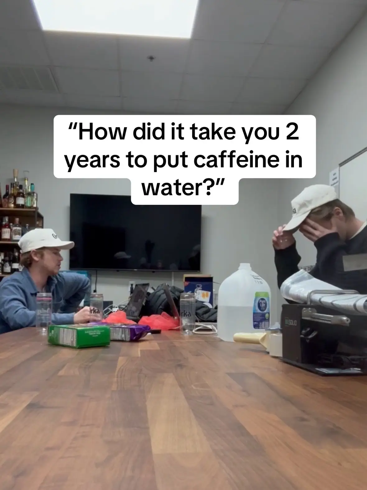
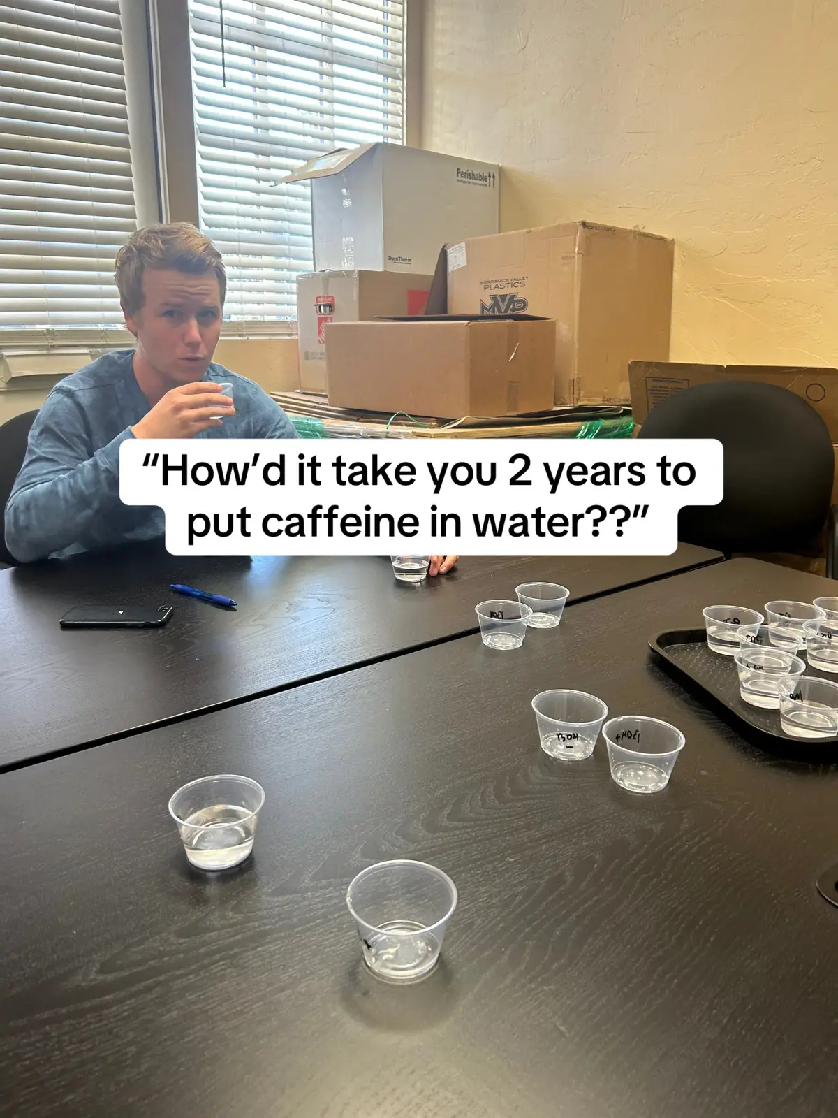
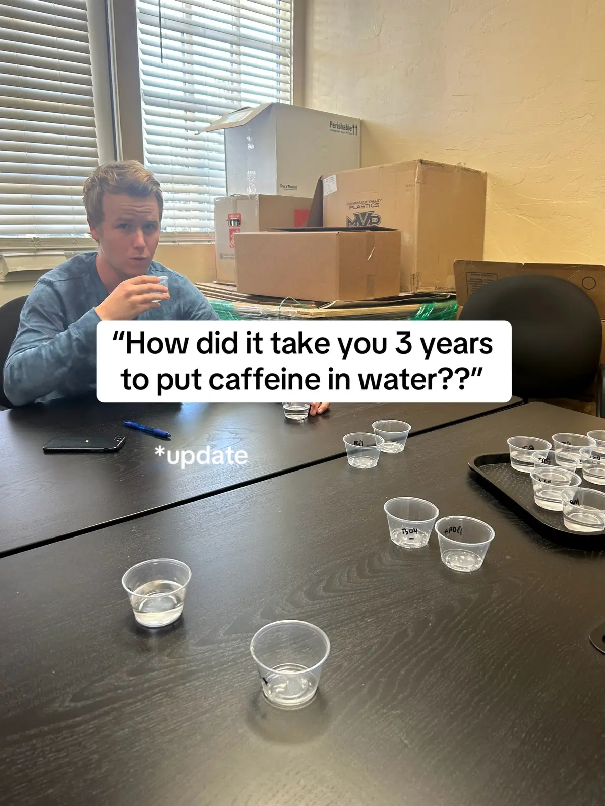
The post effectively uses a visual storytelling approach to showcase the product's design evolution, tapping into consumer interest in branding and product development. The clear progression from initial concepts to the final viral design, combined with the intriguing contrast of high caffeine content presented as simple water, likely resonated with viewers.
Summary
This post showcases the evolution of Orka Energy Water's packaging design from 2023 to 2025. It highlights the design process, including early concepts and refinements, emphasizing the goal of making the product look like water while containing 150mg of caffeine.
Structure
- 1Introduction to the packaging design evolution (2023-2025)
- 2Early concept: clear can to show it's just water
- 3First renderings: not great, wanted to leverage the clear can
Original caption
#design #packagingdesign #energydrinks #caffeine #artjourney
More from @drinkorka
More breakout videos from this creator.