Loading video…
All breakouts
67.8OtherContrarian hookConsumer Apps
Hook
Touch surfaces don't want to be vertical.
@verge
477.2K followers · usually 17.9K views a post
Views
1.2M
Likes
61.5K
Comments
2.0K
Shares
7.2K
Why it worked
The video leverages a famous, ironic clip of a tech icon to create a compelling narrative about how product design philosophies evolve over time.
Summary
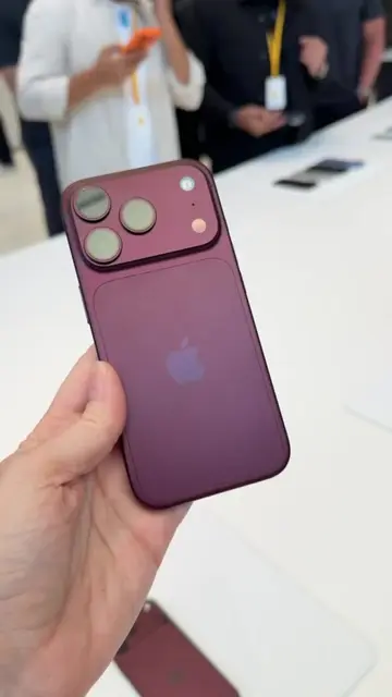
The video uses a clip of Steve Jobs from 2010 explaining why touchscreens on laptops are a bad idea, juxtaposed with a 2026 demonstration of a touchscreen MacBook Pro. It highlights the irony of Apple's shift in design philosophy over time.
Structure
- 1Steve Jobs explains why vertical touchscreens are bad
- 2Demonstration of a 2026 touchscreen MacBook Pro
- 3Comparison of the two design philosophies
Product placement
Apple (a) ACTS: The video contrasts a 2010 Steve Jobs presentation against a 2026 touchscreen MacBook Pro. The 2026 device is operated to demonstrate touch functionality in various applications, which is the central point of the video. Removing the Apple brand would change the video as it is a specific critique of their product evolution.
On-screen text
Steve Jobs, Apple (2010)
SOURCE: APPLE
Apple (2026)
Transcript
Touch surfaces don't want to be vertical. It doesn't work. It's ergonomically terrible. Touch surfaces want to be horizontal. It gives great demo, but after a short period of time, you start to fatigue and after an extended period of time, your arm wants to fall off.
Original caption
2026: Apple proudly announced a new touchscreen MacBook Pro 2010: Apple thought differently
More from @verge
More breakout videos from this creator.