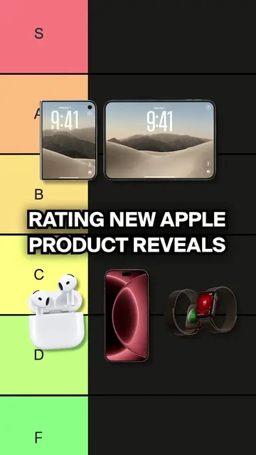
Loading video…
All breakouts
28.4Talking HeadDirect Question hookB2B
Hook
You miss when logos looked good?
@nogood.io
192.6K followers · usually 3.8K views a post
Views
84.3K
Likes
6.8K
Comments
114
Shares
65
Why it worked
The video uses a relatable, nostalgic topic that sparks debate, combined with fast-paced editing and clear visual examples that keep the viewer engaged throughout.
Summary
The creator discusses the evolution of logo design from the detailed, realistic style of skeuomorphism to the modern, simplified flat design. He argues that while flat design is more practical, it has caused brands to lose their unique visual identity.
Structure
- 1Introduction to the shift from skeuomorphism to flat design
- 2Explanation of what skeuomorphism is and why it was used
- 3Reasoning behind the shift to flat design
- 4Critique of the loss of brand personality due to oversimplification
- 5Closing question to the audience
Call to action
But what do you prefer, flat design or skeuomorphism?
On-screen text
WHEN LOGOS
GOOD
FLATTER
2010S
GOOD
SKENOMORPHISM
AS IT
DUE TO
LIMITED SCALABILITY
FLAT DESIGN
RADICAL SHIFT
Transcript
Original caption
Flat or skeuomorphic, which wins? 😮 #logos #flatdesign #minimalism #marketing #design
More from @nogood.io
More breakout videos from this creator.