Loading video…
All breakouts
6.5Talking HeadHow-To hookSaaS
Hook
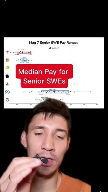
If you are in tact looking for a job, keep this graph in mind.
@solesontech
54.6K followers · usually 4.0K views a post
Views
25.9K
Likes
699
Comments
13
Shares
82
Why it worked
The video provides valuable, data-driven career advice for software engineers by analyzing compensation and company growth trends. The visual graph makes complex information easy to understand, and the creator's clear explanation and categorization of companies offer actionable insights.
Summary
This video analyzes a graph comparing senior SWE pay to workforce trajectory over the past 24 months. It categorizes companies into "Money and Momentum" (high pay, high growth), "Steady Climbers" (positive growth, moderate pay), and "Under Pressure" (low pay, negative growth), advising viewers to aim for the upper right quadrant.
Structure
- 1Introduction to the graph and its axes
- 2Explanation of the four quadrants
- 3Analysis of companies in each quadrant
- 4Discussion of Nvidia's placement
- 5Consideration of Meta's placement and job security
- 6Call for viewer opinions
Product placement
The video discusses a graph from levels.fyi, which is presented on screen. The graph itself is the primary visual element being analyzed.
Call to action
Let me know what you think of this graph.
On-screen text
Where should I vs. workforce as a SWE in 2026?
Senior-SWE pay vs. workforce trajectory over the past 24 months: how much each company grew, or how deeply it cut.
STEADY CLIMBERS
+300%
+200%
+100%
0%
-30%
UNDER PRESSURE
Source: Levels.fyi's economy disclosures for public companies and SEC filings. Growth % is not headcount growth (log scaled). Growth % is not workforce growth. Based on performance.
$200K
$400K
Median Total Compensation
$600K
$800K
BIG CHECKS, BIG CUTS
MONEY & MOMENTUM
Anthropic
OpenAI
Databricks
Snowflake
Ramp
Datadog
Stripe
Uber
Nvidia
Apple
Google
Amazon
Meta
Salesforce
Microsoft
Tesla
Walmart
IBM
Oracle
Intel
levels.fyi
Original caption
High pay high growth tech companies #TikTokLearningCampaign
More from @solesontech
More breakout videos from this creator.