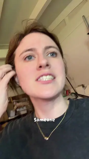
The video provides a practical, step-by-step tutorial on a common problem faced by artists (digitizing artwork for prints) using accessible tools (a smartphone and Canva). The creator's clear explanations and demonstration of editing features make it highly valuable and shareable content.
Summary
The creator demonstrates how to use a phone and the Canva app to create prints of artwork, even without a scanner. The tutorial covers adjusting lighting, cropping, and color editing within Canva, and also provides guidance on print settings to ensure the best quality.
Structure
1Introduction: Selling prints from your phone without a scanner.
2Demonstration of using phone camera and natural lighting.
3Editing the photo in Canva: cropping and color adjustments (temperature, tint, brightness, contrast, shadows, whites, blacks, vibrance, saturation, sharpness).
Original caption
How to make prints using just your phone!! Everyone say thank you @MJ St. John
More from @lizzbianne
More breakout videos from this creator.
4
Changing background colors in Canva.
5Printing process: scaling, paper type, print quality, and color controls.
6Final output and tips on monitor calibration.
Product placement
MJ St. John (creator mentioned in caption, not seen or heard acting)
Canva (app used to edit photos, interface operated)
Etsy (website tab visible on laptop screen, merely appears)
Printful (website tab visible on laptop screen, merely appears)
Canva.com (website address visible on laptop screen, merely appears)
On-screen text
Start selling prints
From your phone
Transcript
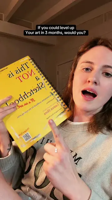
If you do not have a scanner to make prints with your artwork, you can still make prints with your phone. Here's how we're going to use our phone. Thank you MJ for this. I was on his live earlier and he told me that he just doesn't have a scanner, so he doesn't know how to make prints. And he can't make prints. So I told him during his live, I will make him a tutorial. This sketchbook is too big for my scanner, so we're going to take a photograph of this. I do have these studio lights all over the studio. I've got three of them. There's no overhead lighting in here. So I could just use those and it would be good enough. But I'm going to work under the assumption that the only tool you have is your phone. So you have to have daylight. It does have to be daylight. If you do not have soft box lighting, you have to do your lighting. Go somewhere that has even light. If there's shadows going across it, you cannot take your photos there. Full sunlight's good. It's 6:30 in the morning for me, so it is still like really soft outside, which is honestly the best. Because you get a soft box effect without having a soft box. So get neutral lighting and then click time's two. So longer length lens. Make this more even and it won't distort your image as much as the one. Get close up, get far away. Inside. Contacts. Spicy. Everyone say good morning fawn. That's just a pillow. It's not like a. It does look like she's trapped. We're gonna go from our phone. We're gonna go to Canva. Flyers. The size of regular printer paper. We're gonna upload our photos. Just pick a couple of them. Pick the first one you want to edit. If you do not get the image straight, that's okay. Double tap on it. Hold down this rotation key at the bottom. And then you'll be able to straighten it up from there. You're gonna notice the white background looks blue instead of white. There's a couple things you can do here. So why the paper looks blue, even though it's supposed to be white. And that's because my background is a little blue. Then you can adjust the tint. Going either way. I actually think mine's pretty neutral. If not a little pink. So I'm just gonna slide it just like a negative six. And then overall, this is really dull. So we're gonna bring up the brightness. Bring up the contrast. But you don't want to blow it out. So you see how right here you start to lose details. So a smaller number, around 20. Highlights. Highlights are going to be anything that's white. So you can get too far and start blowing out details. So I'm going to set it to 28. Shadows. Shadows are going to be the darkest darks. So if you bring that down, it's gonna get darker. If you bring that up, it's gonna get lighter. Me, I want my darks to be a little bit darker. So I'm going to go plus eight. Whites. Whites are pure white. Anything that's pure white will become pure white. You can see how it's not selective. This is more refined than programs like Affinity, which is also free and owned by Canva. Or even Photoshop. Personally, I don't touch the whites. Some people do like to make their whites darker because sometimes this can give a film effect. Personally, I'm not a fan of film effects. Blacks. Same thing with blacks. You can make the blacks lighter by pulling it this way. Darker pulling it this way. I want my blacks to be a little bit darker. So I'm going to go plus eight. Vibrance. Vibrance is going to be like your big punch of color. Saturation is going to be like your big punch of color. Sharpness. Increasing sharpness is going to add almost like a grain to it because it's trying to find clear. Find clear details. Those. Sharpen those. So if you pull it this way, it's going to blur the image. This way it's going to make it a little pixelated. Which again, in programs like Photoshop or Affinity, it's not actually sharpening it. It's going to degrade the image quality. So you don't really want to use too much of it. One. Idea. One. This is going to be like a little bit of a. Like this. This is going to be like a little bit of a. I'm gonna do is increase clarity. It does a couple things. It'll increase sharpness a little bit. Contrast a little bit. Evenly across the entire image. I missed all my phone settings, but it's called color edit. I messed around with it some more to get everything else to be truly black and then this stay in color. I brought the vibrance all the way to negative 100 and then the saturation up to 55. These are my final settings. I've made a couple of versions. So let's see how they look. Something else to take note of is the colors on your monitor are not going to be the same that you see on the printer. I do have a monitor color calibrated. I use my PC a lot for photo editing because that PC is like a bajillion years old. Shops and they'll calibrate it for you. Some don't charge. So no guarantee on that. If you're printing from home. Here's some print settings for you. So this is going to scale to fit. Actually, you need to change it to just say 100%. That way when you cut it, it's true to size. What's in printer options. You're gonna eye. Make sure that your printer is in control of the color. Unless you're printing from a place like Photoshop. That is just computer argue in charge. No. If you're printing from home, here's some print settings for you. Select the paper that you're using. I'm using premium presentation paper matte. Make sure that you change it to the highest quality possible. Print. Here's how they came out. Overall, I think the color actually looks really good. Although I will say, I kind of like the pink. So if we're doing it like this, we're gonna go back to edit. Adjust. That. We're gonna fix that white balance back down. I'm sure I missed it on my phone, but it's called color edit. I messed around with it some more to get everything else to be truly black and then this stay in color. I brought the vibrance all the way to negative 100 and then the saturation up to 55. These are my final settings. I've made a couple of versions. So let's see how they look. Something else to take note of is the colors on your monitor are not going to be the same that you see on the printer. I do have a monitor color calibrated. I use my PC a lot for photo editing because that PC is like a bajillion years old. Shops and they'll calibrate it for you. Some don't charge. So no guarantee on that. If you're printing from home. Here's some print settings for you. So this is going to scale to fit. Actually, you need to change it to just say 100%. That way when you cut it, it's true to size. What's in printer options. You're gonna eye. Make sure that your printer is in control of the color. Unless you're printing from a place like Photoshop. That is just computer argue in charge. No. If you're printing from home, here's some print settings for you. Select the paper that you're using. I'm using premium presentation paper matte. Make sure that you change it to the highest quality possible. Print. Here's how they came out. Overall, I think the color actually looks really good. Although I will say, I kind of like the pink.
 219 videos120 creators