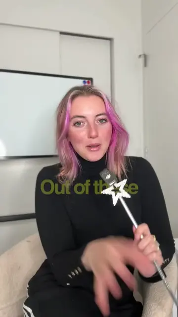
Loading video…
All breakouts
26.6Talking HeadDirect Question hookSaaS
Hook
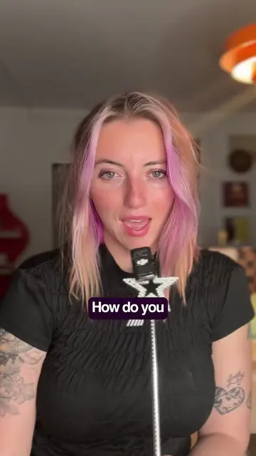
Which loading option do you choose?
@synsation_
297.2K followers · usually 29.0K views a post
Views
748.9K
Likes
69.6K
Comments
266
Shares
1.8K
Why it worked
The video breaks down complex UX concepts into easily digestible parts, using clear examples and a conversational tone. The creator's series format encourages viewers to return for more content.
Summary
The video explains different loading options in UI design: skeleton screens for entire pages, progress bars for estimating time, inline spinners for small actions, and optimistic UI where the system assumes success. It highlights how each choice impacts user perception and experience.
Structure
- 1Introduction to loading options
- 2Skeleton screens for page loading
- 3Progress bars for time estimation
- 4Inline spinners for small actions
- 5Optimistic UI for instant feedback
- 6Preview of next video on spinners
Call to action
Follow
On-screen text
Skeleton screen
Spinner
Progress bar
Part 3
Building with
GOOD UX
Skeleton screens are for
when an entire page
or a large
section of content
is loading.
You're telling the user,
the layout is here,
the data is coming.
That's why you often
feeds like
Instagram, LinkedIn,
YouTube
The page structure is
what shows up first,
content fills
in a little later.
Progress bar
Progress bars are for
how long something
File uploads
Installations
the user needs to have a sense of
how far along they are
and how much longer
they might need to wait.
And if you show
on a file upload,
that it's stuck.
Inline spinners:
These are for small,
contained actions.
Submit
or one part of the page
that's refreshing.
Just a small indicator
We're working on it
there's
Optimistic UI
no loader at all,
and what do I mean
When you like a photo
On Instagram
the heart turns
It doesn't
to confirm.
Later,
it rolls back.
And that
by DESIGN
we're actually gonna
inline spinners
because there's more
to talk about with them.
There's different kinds
and the psychology behind
which ones work
and which ones don't.
see you in the next one.
Follow
Original caption
Part 3 of Building for Good UX #uxdesign
More from @synsation_
More breakout videos from this creator.