Loading video…
All breakouts
3.3Talking HeadDirect Question hookSaaS
Hook
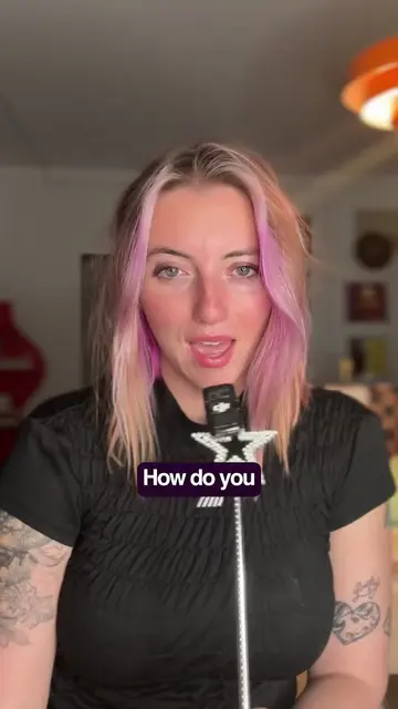
Which error
@synsation_
297.2K followers · usually 29.0K views a post
Views
91.8K
Likes
11.2K
Comments
35
Shares
305
Why it worked
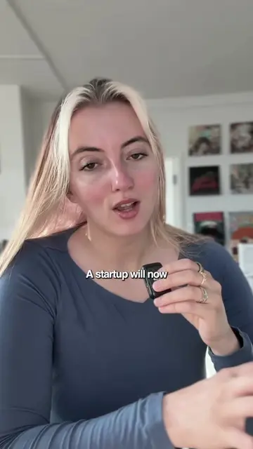
The video breaks down complex UI/UX concepts into easily digestible parts, using clear examples and a conversational tone. The creator's series format encourages viewers to follow for more content.
Summary
The video explains different types of error messages in UI design, focusing on toasts, modals, and in-line errors. It advises using toasts for non-critical, temporary messages, modals for actions requiring user attention, and in-line errors for immediate feedback next to the input field.
Structure
- 1Introduction to error message types
- 2Explanation of Toast notifications
- 3Explanation of Modals
- 4Explanation of In-line errors
- 5Comparison and best practices
- 6Preview of next video on empty states
Call to action
follow for more
On-screen text
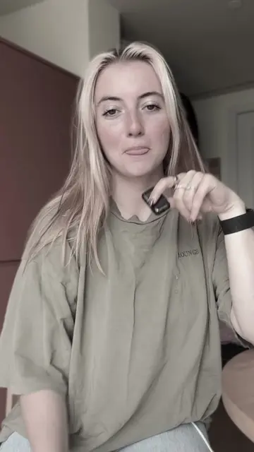
Which error
message placement
do you choose?
Toast notification
Modal
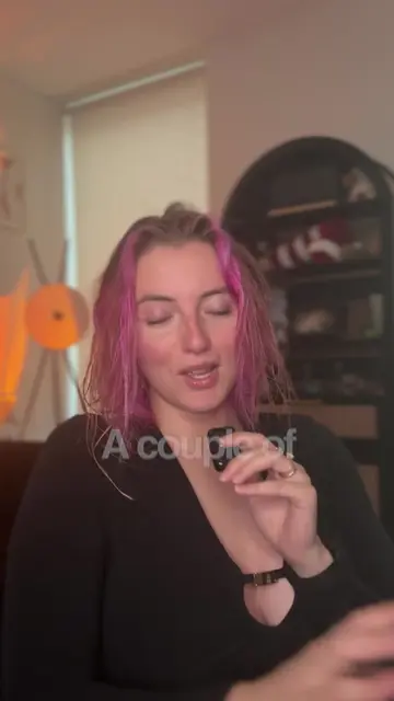
or the bottom
and then it
in a couple of seconds.
This is
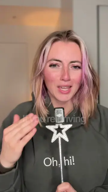
Part 7
of my series
Building for
GOOD UX
So let's break it down.
Toast
A toast is a message
that pops up at the top
or the bottom
and then it
in a couple of seconds.
Don't use toast
for an
Think if
and they miss this,
are they going to be
It's perfect for
"couldn't connect"
"retrying"
Modal
takes over the center
of the screen and blocks
until the user responds.
use this
Only when the user
can't continue
the issue.
for example
a payment fails,
so modal pops up
saying your payment
did not process
and it gives
which is a button
to press
to update your payment.
Access Denied
You don't have access to this project.
Request access
like "you don't
to this project"
with a button
to request access.
block the user,
you have to
give them a way forward.
In-line errors
show up right
next to the thing
as a general rule,
The closer your error is to
your issue, the better.
Create your account
Pick a username to get started.
Username
@alex
Continue
That username is already taken.
show up right
that needs correction.
Right next to a button
that they just
The user click save
and it fails,
it should say "try again"
right next to it.
The user's
eyes are already there.
we're going to talk
about empty states
when there's no data,
so follow for more.
Follow
Original caption
Build for Good UX Part 7 🥳
More from @synsation_
More breakout videos from this creator.